In their best form, infographics are an artistic, effective and clear way of putting information in front of your target audience. Infographic designs are definitely proving to be more in demand as audiences are presented with data all day long on their smartphones, tablet computers and desktops — they need an easy way to absorb information without becoming inundated with what can otherwise amount to spam.
The best infographic designs will be easy to follow, simple, yet original, and universal enough to hit the intended audience right where it makes the most sense. If you want to learn more about how to reach your target audience where they are at, sign up to receive our newsletter for a wealth of information about this and so much more. Then keep reading to find three tips to help you build a better design:
White Space Management
Properly managed white space helps to focus the reader’s eyes on where they need to be, as you leave the space between elements, which is often referred to as negative space, free of design elements. It’s like a rest in music — it’s part of the art where you make a decision not to create anything in a specific area.
The Personalities of Typeface
Most Word programs today come with a great variety of typefaces, and you need to choose carefully. Would you use Comic Sans on a financial report? We’re looking for a “no” here. Serious business typefaces would instead look at the ever-popular Times New Roman, Helvetic and Lato. They offer a non-complicated, personality neutral feel that works in the business space.
If you’re looking to create an infographic design that is for fun, yet informative outreach, you can loosen it up with Pacifico, Lobster and Cabin Sketch, all of which are still easy to read, but have a more playful personality.
Choosing the Right Palette
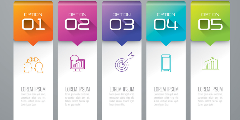
Last but not least, your colors say a lot about what you’re creating. Don’t make it difficult — just start with picking out your primary color, because choosing this will help you nail your secondary colors. Most effective infographic designs use only two and rarely more than four.
Will using your company branding help you choose your primary color? It works for many organizations that want to have that consistency across the board while strengthening their brand awareness. However, if you’ve got content that yearns to use a palette different from your branding, go for it. For example, if your branding follows a blue hue, but you’re putting out an infographic for St. Patrick’s Day, by all means, use green instead of blue.
If infographic design is something you need help with, contact us at SJC Marketing. Our team is ready to assist you in building stunning content that will push your latest campaigns.