The role of design has always been important in business, but in recent years the commitment to consistency in design from brands like Target and Starbucks (these people got customers to abandon the words small, medium and large, after all) have elevated consumers’ awareness of good brand design. You could argue that Gap laid the groundwork in the ’90s by selling khakis with line dancing and Dwight Yoakum. Everyone soon recognized anything sparsely staged with a lot of white as Gap design.
You may be thinking, “We’ve got a logo and our website is completely finished in our colors,” but remember that this slim definition of design is the bare minimum. We have talked about this in our newsletter recently. If you’ve missed out on that, don’t wait another minute to subscribe to recieve the latest updates.
All things being equal in terms of product and price point, your potential customer is going to choose the design they like better. Whether that’s the look of your website or whether your packaging communicates luxury or practicality can be the deciding factor in whether you get the sale.
Consumers Make Fast Decisions. You’ve probably heard that visitors to your website will make a quick determination about whether it’s worth more of their time, but you may have underestimated just how fast these decisions are made. Google tested people’s reactions to website design and found that 17 to 50 milliseconds were all it took to make a first impression. To provide context, consider that an average eye blink is a comparatively whopping 100 to 400 milliseconds.
When a visitor makes this quick decision, there are a lot of factors influencing their thoughts. They’re wanting to know who the company is, whether they are credible and trustworthy and whether they can find what they want there.

Design Helps You Stand Out. Experts estimate that the typical consumer is exposed to an average of 5,000 advertisements each day, compared to only 2,000, 30 years ago. Nobody can absorb that many messages in a day; in fact, the study found that only an average of 86 of those ads captured the awareness of the consumer.
This highlights the importance of using design to cut through the marketing noise. When you and a competitor are vying for the attention of your target market, keep in mind the attractiveness bias: human beings tend to perceive beautiful things as being superior.
Investing in Design is Good for Your Bottom Line. It’s common for companies to deprioritize design because they can’t see a clear link between design and increasing profits. The research says that link is there, screaming in neon colors.

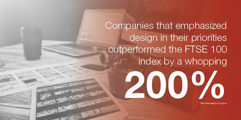
The Design Council examined 63 companies traded on the Financial Times Stock Exchange (FTSE), reviewing their practices over a 10-year period. Those companies that emphasized design in their priorities outperformed the FTSE 100 index by a whopping 200%.
Consumers are constantly bombarded with content to consume and marketers that want their attention, and they’re more likely to spend their time with a website or piece of content that’s satisfying to their senses.
Design Helps You Control the Perception of Your Brand and Products. In his book, Blink, Malcolm Gladwell discusses how small changes in packaging or branding can impact consumers’ perceptions. In an effective example, Gladwell describes how that happened in the branding for 7UP, specifically adding more yellow to the packaging, caused consumers to say that the soft drink tasted more “lemony” than when the packaging remained the same.
Similarly, placing a sprig of parsley between the “r” and the “m” in the Hormel logo caused consumers to perceive it as a product that was fresher than when it was packaged with its original logo.

SJC Marketing helped BFIT CrossFit use subtle design choices in a logo redesign to combat the perception that CrossFit is only suitable for fit, elite athlete types. In order to achieve a design that reflects both athleticism as well as the idea that CrossFit can meet you right where you are, clean lines and shape were a focus, and emphasis was placed on the “B” in BFit. The latter is a message that consumers can be themselves, be their career or life role, and BFit. Beveled edges, and slanted, san serif typeface combine for an added athletic feel to the new logo design.
Controlling the perception is also important when it comes to consistency. Consider how the Coca-Cola logo might look with a slightly more orangey red as its background, or that you would immediately notice if the M&M guys were suddenly portrayed with the Ms on their bellies in a different font. You would notice, right? Or maybe you need to step up your chocolate consumption to a respectable level.
People notice when your logo or colors are a bit off, too. Or worse, you’ll begin to let a few things slip through. Maybe it’s a flier with the wrong font, or you approve a radio commercial where the tone and voice are not quite the personality of your brand. Before long, your brand isn’t recognizable anymore.
The best designs are those that disappear. The consumer is enjoying the experience of your brand and your design so much that they didn’t happen to notice that it was the vibrant color scheme or the distinct look of your images creating that experience.
To learn more about how design can give weight and momentum to your brand, contact us at SJC Marketing. We’ve got a lot of ideas about how to make your design stand out, and none of them require you to learn line dancing.


