It’s probably been a few years, or even a few decades since someone asked you what your favorite color is. It’s usually a childhood playground topic, left alone once you enter the realm of deserted island games where book and movie preferences seem to sum up your personality in a more satisfying way.
Or do they? You’d probably be hard-pressed to narrow it down to just one movie and one book, but as soon as you read our title, you silently yelled, “red!” Or maybe that’s just because you red-loving people tend to yell.

If you prefer blue, you serenely acknowledged as much as you started reading this in your favorite comfy chair by the fireplace.
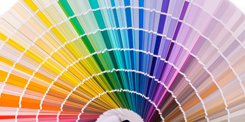
That’s right—there’s some research out there that says your favorite color is associated with your personality. Here’s a quick rundown:
Red: You tend to be passionate, full of energy and action. Power goes with red, too, as well as confidence and even anger.
Orange: If your favorite color is orange, you probably already know that you’re a creative type and also might be adventurous, joyful and warm. Vitality and humor are also orange-y traits.
Yellow: You’re all cheerful playfulness, happiness and youth, Because it’s light and bold at the same time, yellow is a complicated color.
Pink: The most loaded of all colors, right? It’s associated with girly playfulness, youth and sweet, delicate romance.
Blue: You’re the one everyone can count on, with serene trustworthiness, peaceful vibes all around. Stability, tranquility and relaxation all go with blue, but it brings a fresh, clean feel as well.
Green: You’re natural, fresh and full of harmony and balance, you green-lovers. But you also have an association with money, so green can be pure and natural or…not.
Purple: Purple fans tend to be a bit mysterious and unexpected. You may also love a little luxurious, even royal feel to things and appreciate all things wealthy.
Black: Ooh, you’re so understated and elegant. You’re full of power and mystique, with everything under control.
Brown: Brown fans tend to be earthy, dependable, warm and old-fashioned. You may also be warm and dependable.
White: You’re all about purity and cleanliness. But white can also be peace and honor, as well as youth and simplicity. Watch out, though. It can also be cool indifference.
Whatever your favorite color is, you probably saw yourself a bit in that description (unless you made the ultimate dodge and declared yourself an equal fan of all colors).
How does all of this relate to your marketing?
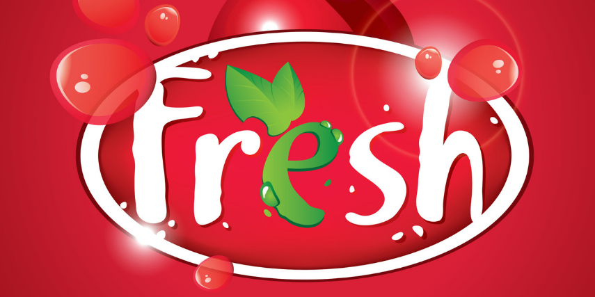
Colors in Branding: When it comes to branding and design, there’s probably a color scheme that fits naturally with what you do or produce. It may begin with your favorite color, but it will likely also have to do with what it is you’re selling. For instance, no produce brand should ever go with brown, because brown can be associated with decay. Instead, a food brand should be green for fresh and natural or a bright color for the vibrancy of life.
For those in the entertainment industry, red or orange is a good choice. A company founded on green principles should go with green and brown. If you run a bank and want to communicate dependability and trustworthy steadiness, blue or brown are good color choices.
You can also create your design based on what you want your customers or clients to feel when they think of your brand. If you want them to associate you with excitement, choose one of the more vibrant colors. And there are variations of every color; a neon blue is going to elicit feelings closer to a red than a soft blue will.
Using Colors Well: One of the best ways to test how colors are working in a landing page or an infographic, for instance, is to do A/B testing. Try using two different colors schemes and then use analytics to see how your audience is responding to each color combination.
You can also use red, yellow or orange in areas where you want to grab the attention of your audience. You may want to use the boldest version of your colors to outline CTAs or highlight a promo button.
You may also prefer to use colors differently depending on the setting, just like you do in real life. Maybe you choose gray running shoes every time and have for the past several years, but you would never wear a gray shirt or decorate your house in gray. In the same way, you may want a color scheme for design that incorporates a range of colors for different uses. You may love orange on company shirts, but you don’t want it as the main background color for your website design.
Consistency is Key: Now that you know what the underlying traits are of color preferences, it’s easy to see why you should be consistent across every part of your branding. When you develop your brand design, you should be presented with an exact color scheme, and you should check your colors against it regularly.
The next time you’re at a dinner party, ditch the conversations about what everyone’s read or watched. Try a throwback to preschool and ask everyone what their favorite color is. You’ll soon know more about each person there than an hour’s worth of conversation could tell you.
And when you’re determining your color scheme for your brand design, you’ll be equipped to communicate to your audience exactly who you are in a single glance. Want to get started with consistent design for your brand? Contact us at SJC Marketing. And, oh yes…we’re definitely red.