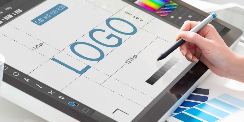
Has your logo become invisible to you? Maybe you’ve seen it at the top of the letterhead, across your website and on every other piece of communication for so many years that you fail to see it anymore. If that’s the case, it’s time to consider your logo design and whether it’s time for a change.
Maybe you’re one of the lucky few that landed on a timeless logo design that flawlessly transitioned as your business grew and changed over the years (i.e., Coca-Cola or Target). For most companies though, there’s a need to evaluate the logo now and then to be sure that it’s still working hard for your brand. Read more on our site about how one brand made the transition when they discovered they needed to rebrand and design a new logo.
Here are six reasons you may need a new logo:
Your Company Has Changed Its Mission. Maybe you previously delivered bottled water to coolers in corporate settings, but your business model has expanded and now you’re more of a full-service beverage provider. If your logo sports a water droplet or a spritz of water, it’s time for a new design. A logo should reflect the total scope of your brand.
Your Logo Doesn’t Scale Well. If your logo of a tree silhouette looks great on a billboard but becomes a tangle of indistinguishable branches on a business card, you need a new logo design. Your logo should be clean and recognizable at any scale so that it can be used consistently across communications.
Your Colors Don’t Mean Anything. One of the big reasons that companies undergo a new logo design is because the color scheme has become irrelevant or never was relevant. If you randomly chose yellow and orange for your original logo, but over time, it’s become clear that if your brand were a person, they would always wear green and yellow, you might be compelled to undergo a logo design change.
Your Design Is out of Date. This is different from a logo that is retro by design. This is a logo that was hip when it was first debuted, but now has a decidedly ’80s or ’90s look about it. Be careful not to make the same mistake again by choosing millennial pink as your logo’s main color or Facebook blue, unless you’re a trend-following company in general. You’ll be current for a minute or two, but you’ll be back at the design stage again painfully soon.
Your Logo Design Doesn’t Fit the Personality of Your Brand. If you’re a financial advising company, your logo shouldn’t have a hand-drawn look to it, and if you’re a family entertainment venue, try to avoid too many dark colors and straight lines. Your logo should look how your company feels.
Your Font Is Hard to Read. Everything doesn’t need to be in Times New Roman to get your message across, but it shouldn’t require any squinting, either. Make sure your logo is easily readable, no matter what the size, and that the specific words you include fit your intention for your logo, as well.
When you’re ready to pursue a new logo design, contact us at SJC Marketing. With our in-house graphic design team working alongside experienced marketing specialists, we create a logo that captures your brand in a single, easily-recognizable glance.


