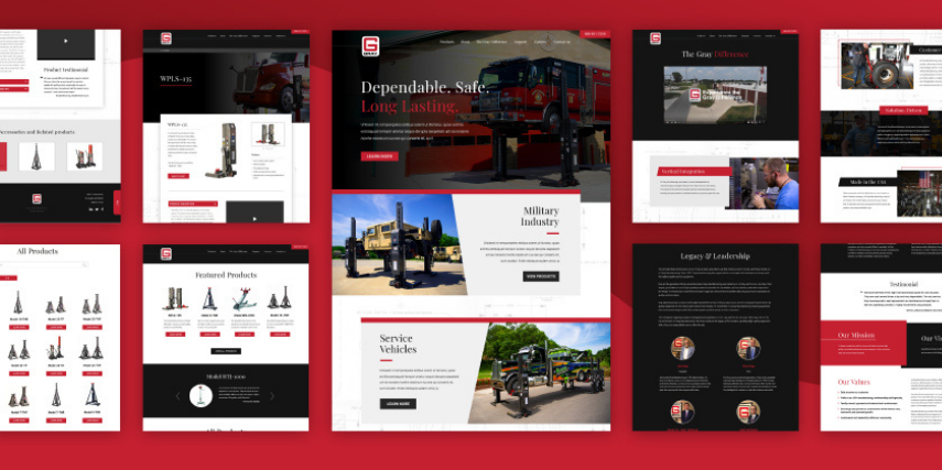
Web design is sort of like fashion. You think it’s great, and it’s almost impossible for you to see that it’s not great, even though everyone who sees it knows you’ve missed the mark.
There are some obvious things you’ll catch and repair right away because they’re obvious, like 404 error messages or a photo that just won’t load. But there’s plenty that may seem fine to you, but visitors to your site are looking at you like you’ve just paired leopard print pants with a polka dot sweater.
It’s hard to view your site with objectivity, so here are four missteps you should watch for as you determine whether your web design is effective:
Misuse of White Space: The areas between design elements aren’t wasted space, but an important part of your web design. This space helps images stand out, makes your text easy to read and gives an overall pleasing aesthetic to your site. Make sure you are using white space consistently across your site and that design elements aren’t too crammed in to make them effective.
Too Much (or Too Little) Content: You’ve got a lot of great features in your product or service, plus so much great information to help visitors make a decision, that it’s tempting to make it all available on the home page. Or, on the opposite extreme, you make your visitors work hard to get to your content, navigating one menu after another in a maze of drop-downs. Keep your pages clean, your menus simple and clear, and make sure content is organized in a user-friendly way.
It’s a good idea to make content easy to skim (think short paragraphs and quick videos), avoid too much industry-specific code language that might frustrate visitors, eliminate extra steps and hide extra options like collapsible menus that might otherwise add clutter.
Confusing or Hard-to-Find CTAs: If you’ve ever been sort of lost on a web page, wondering where you should go next, you’ve experienced a common web design misstep. CTAs should guide the visitor, showing them what to do next. Done well, a CTA can move your visitor along in the conversion process, helping them learn more about your products and eventually make a purchase. Make CTAs stand out in a bold color or in a text box that makes it clear where their eyes should rest.
Ads that Obscure: Take a test-drive of your site. If you have pop-up ads, are they excessive or do they block critical content? Maybe they pop up right over your CTA or they simply function badly, not clearing away when you click the “X.” Your ads are intended to help, not hinder your business objectives, so make sure they are not turning visitors away.
Oh, and Don’t Forget…: From slow load times to a site that’s not optimized for mobile, there are plenty of other, more obvious things that may be derailing your efforts to welcome visitors to your site. Make sure these basics are in place, too.
We’ve noticed your fashion sense, and you look good. Let’s make your web design just as on-trend. SJC Marketing can help your website tell your brand story and move casual visitors to loyal customers.


